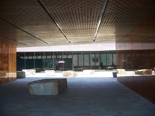
The picture in the last post, two palms flank the walk and lead you to
the cool, dark, quiet walk through to the bright glass and copper
entry court and door to the de Young. The rough stone objects invite
you in and I like the play of smooth, shiny and rough.
I'm back in Tucson tonight and the Monsoon are Welcoming me home!
more on this soon !
Cheers, parsnip


I can see why you like this building so much with it's modern edge meeting a more natural and rustic side. Glad you had a nice trip
ReplyDeleteCool!
ReplyDeleteWhat a beautiful building, so serene and cool looking. I'm going to have to look it up now to see who designed it.
ReplyDeleteEryl. . .
ReplyDeleteHerzog & de Meuron, primary designers
Fong & Chang Architects, principle architects
Hood Design, Landscape Architect, the Fern Gardens are Fabulous
Herzog & de Meuron have designed galleries that showcase the collections so well and move you in and out of the spaces so well .
I have many Museums from all over that I enjoy for different reasons but The de Young works so well on all levels. I wnat to live there !